PT/BR
-
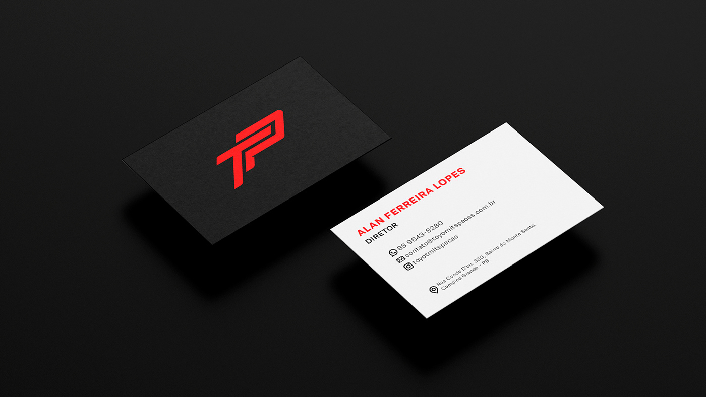
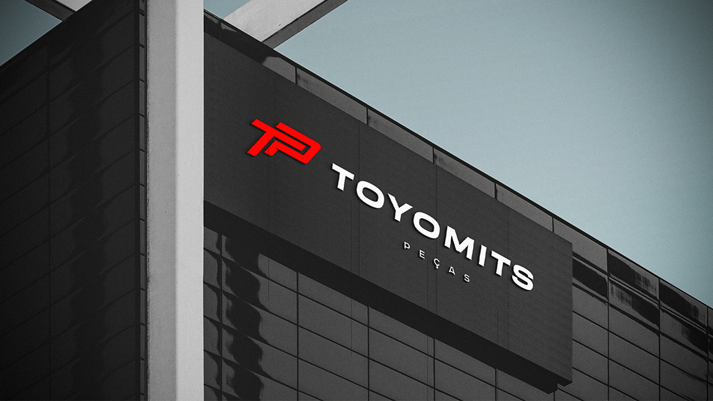
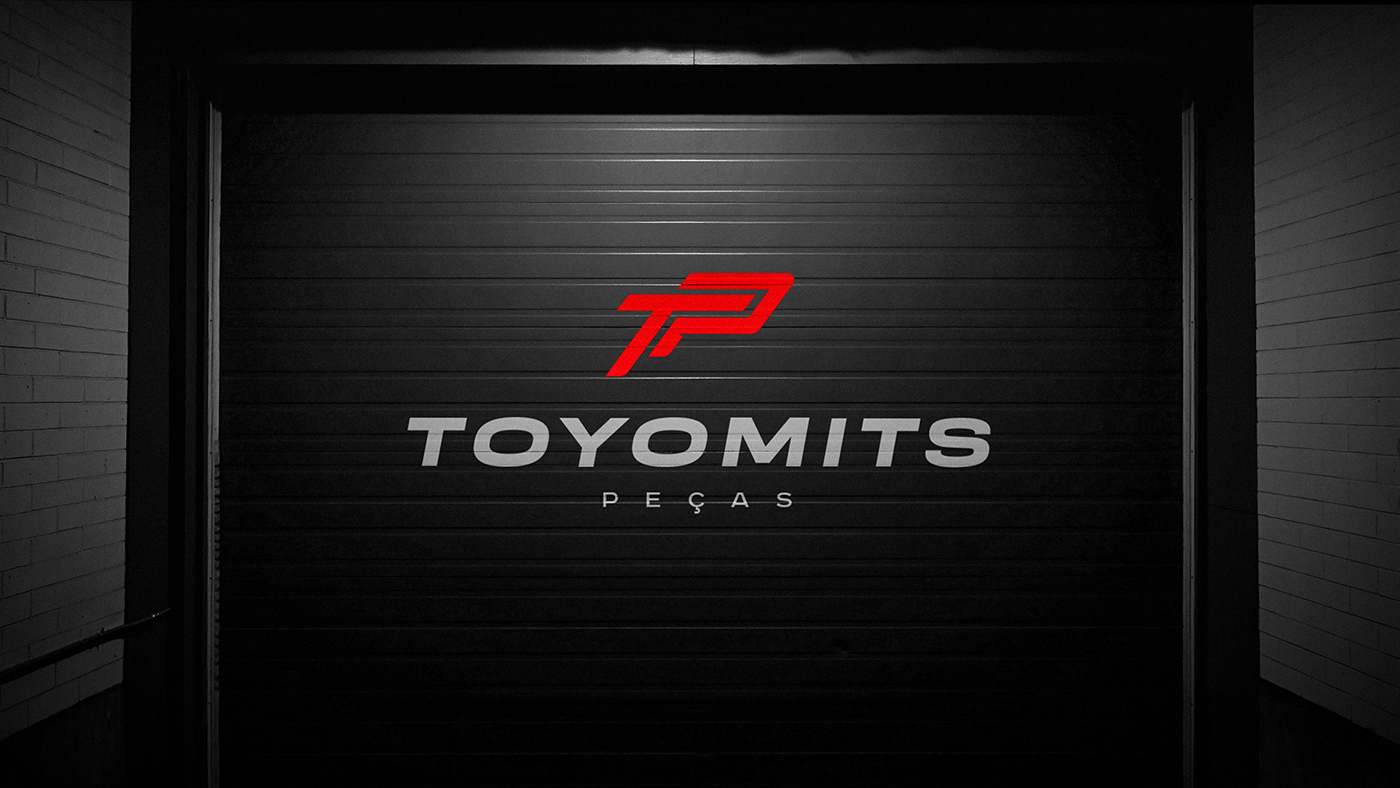
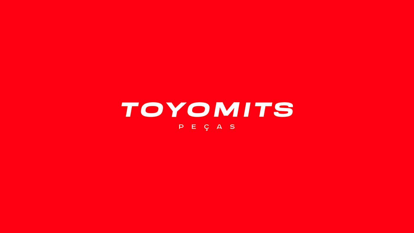
A Toyomits é uma loja de peças automotivas referência quando o assunto é Toyota. Com mais de 10 anos no mercado, a loja se destaca principalmente por conta de sua exclusividade em peças, além de ofertar aos seus clientes um atendimento equiparável a de uma montadora oficial.
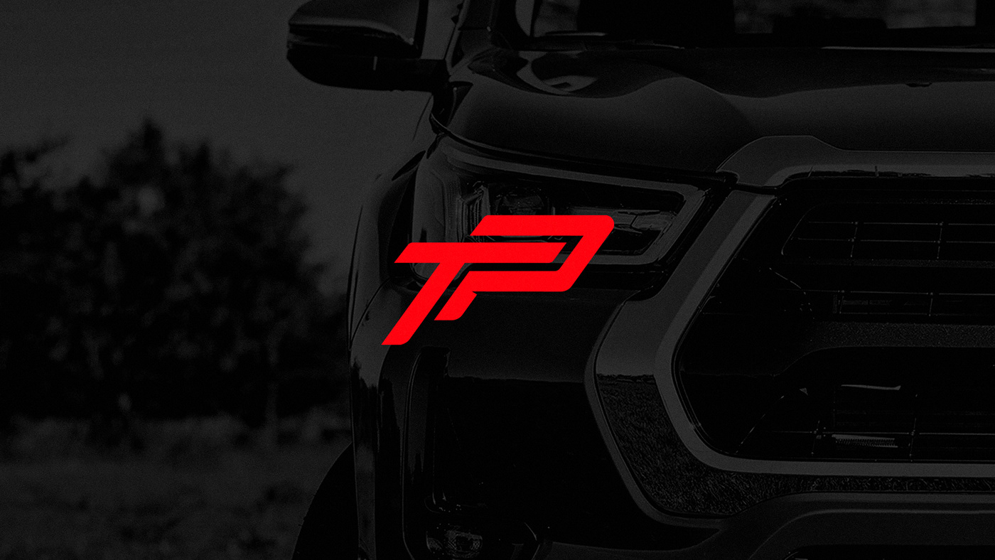
O intuito do projeto de identidade visual era trazer mais seriedade, profissionalismo e autoridade a marca, ao passo que também refletisse o estilo aventureiro e deslocado dos próprios donos.
O intuito do projeto de identidade visual era trazer mais seriedade, profissionalismo e autoridade a marca, ao passo que também refletisse o estilo aventureiro e deslocado dos próprios donos.
EN/US
-
Toyomits is a leading automotive parts store when it comes to Toyota. With more than 10 years on the market, the store stands out mainly due to its exclusivity in parts, in addition to offering its customers a service comparable to that of an official car manufacturer.
The aim of the visual identity project was to bring more seriousness, professionalism and authority to the brand, while also reflecting the adventurous and out-of-place style of the owners themselves.

PT/BR
-
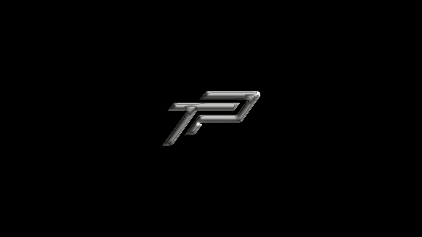
A ideia primordial por trás da criação do símbolo foi a união entre o T e o P, fazendo referência direta a antiga logo da marca, porém, com um nova proposta visual e elegante.O itálico aplicado ao símbolo cumpre o papel de trazer movimento, quebrando um pouco a seriedade pra trazer um aspecto mais aventureiro.
EN/US
-
The main idea behind the creation of the symbol was the union between the T and the P, making direct reference to the brand's old logo, however, with a new and elegant visual proposal.
The italics applied to the symbol fulfill the role of bringing movement, breaking the seriousness a little to bring a more adventurous aspect.

PT/BR
-
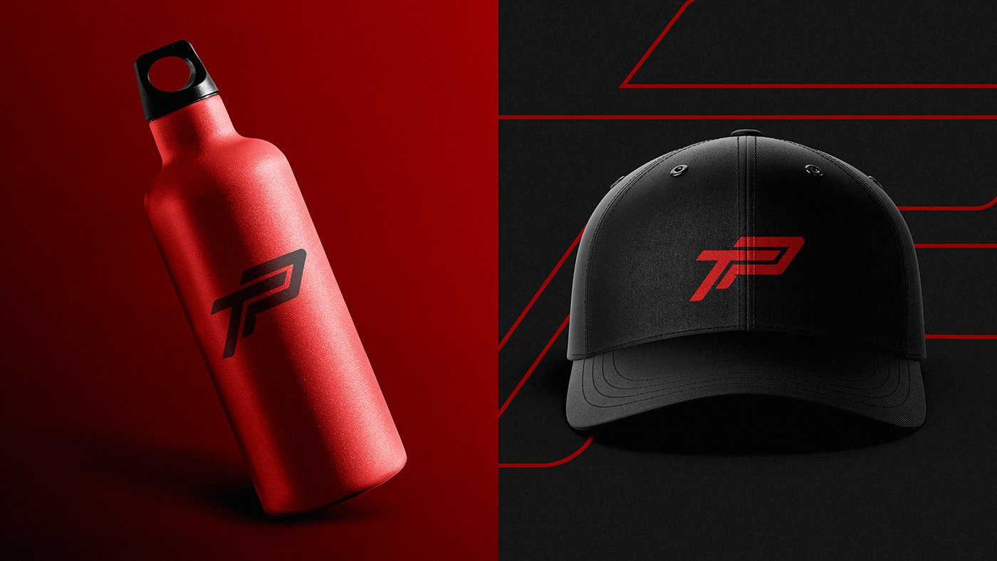
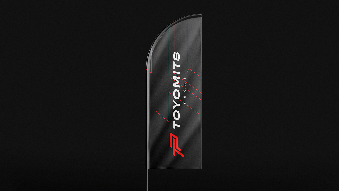
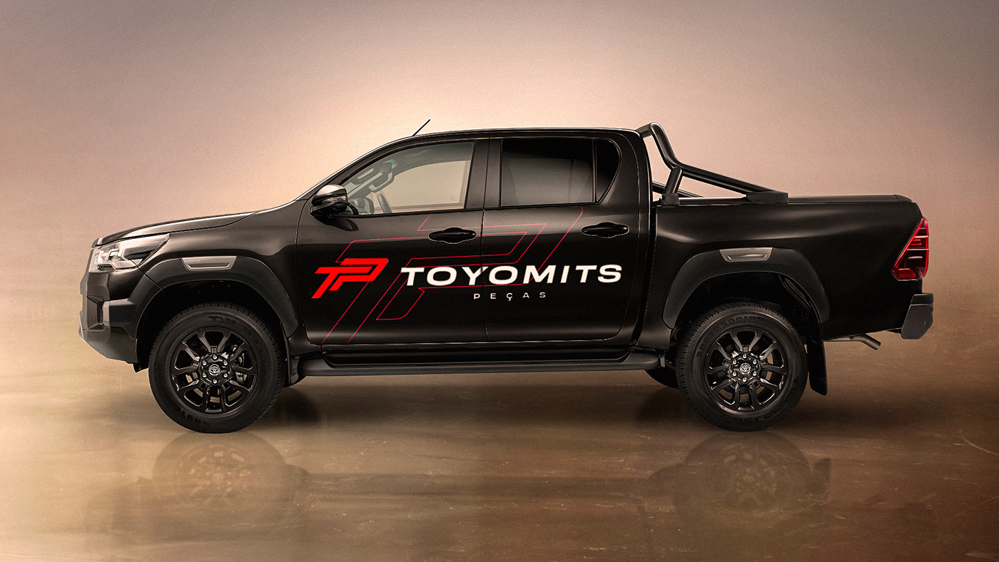
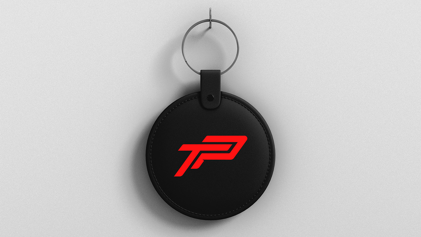
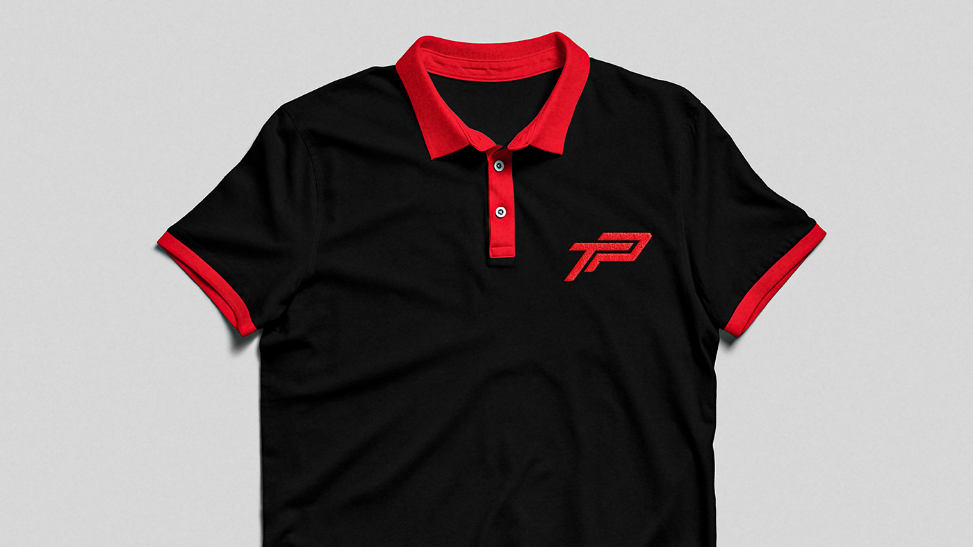
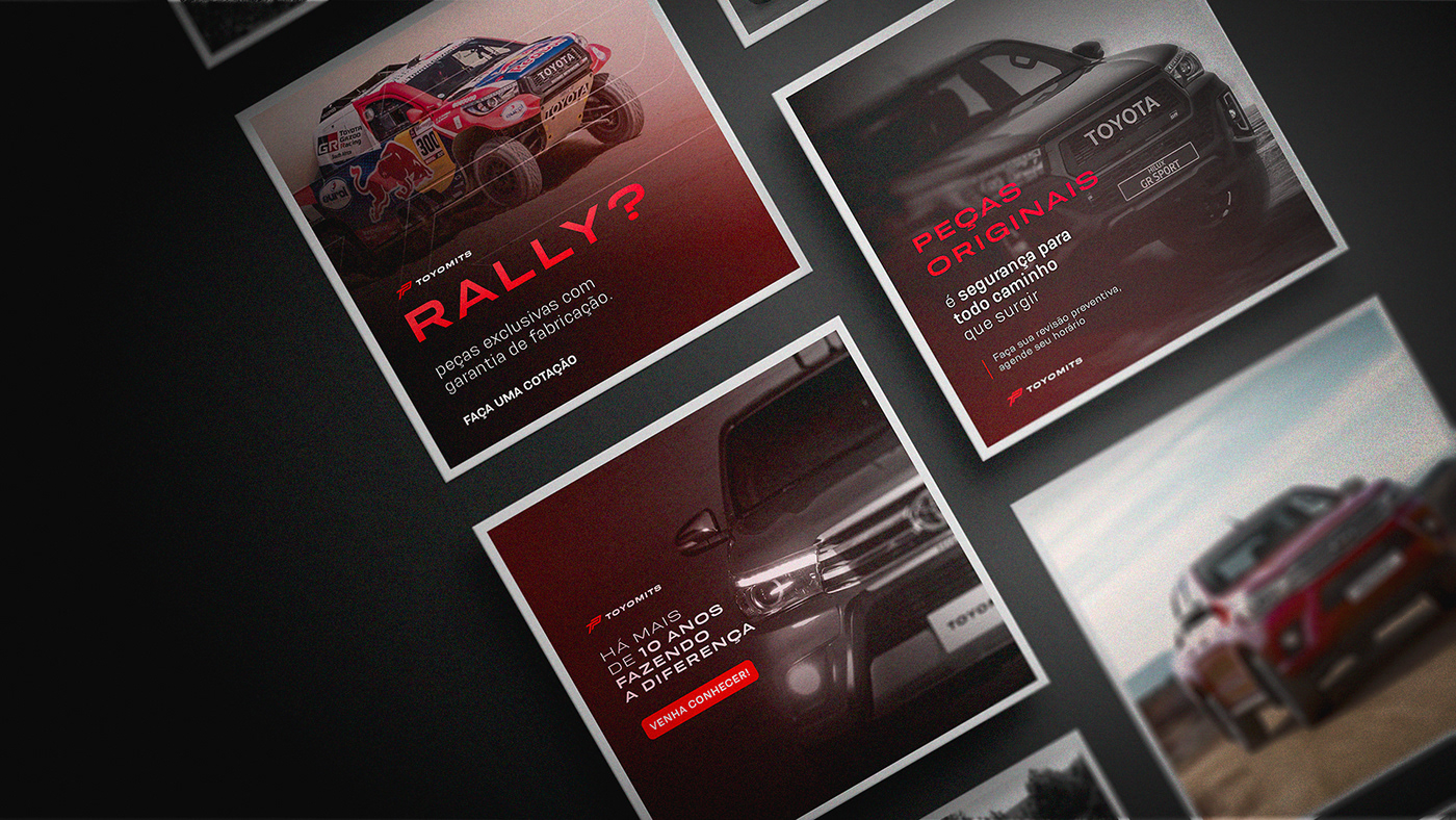
A paleta de cores escolhida mescla o ar aventureiro e rebelde do vermelho, ao passo que dá seriedade e sobriedade com o preto e branco.
EN/US
-
The chosen color palette mixes the adventurous and rebellious air of red, while givingseriousness and sobriety with black and white.
PT/BR
-
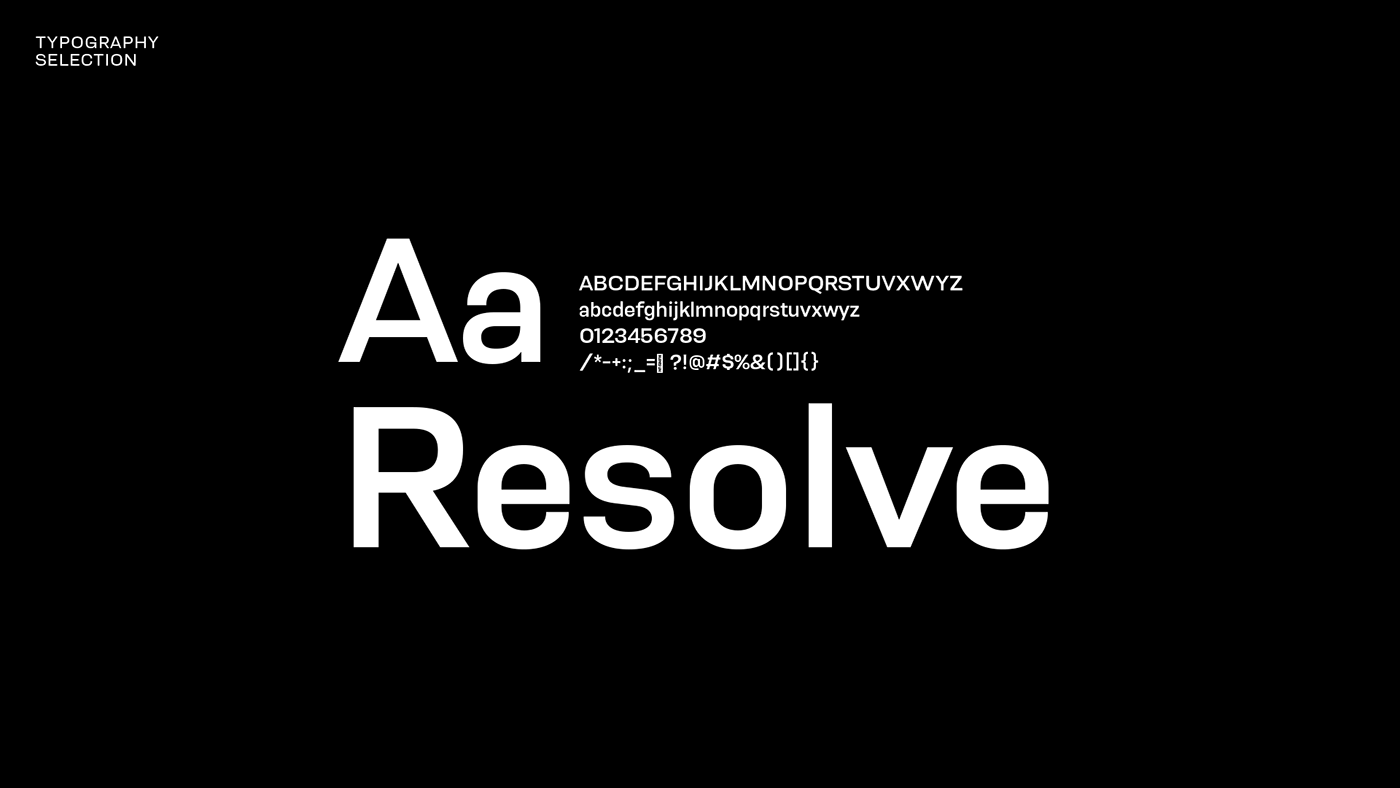
A família tipográfica escolhida auxilia ao mesclar a modernidade e o movimento que o projeto pede. Além de ser utilizada em todas as versões da logo, servirá também para todos os textos de apoio, já que é bem versátil e de fácil legibilidade.
EN/US
-
The chosen typographic family helps by mixing modernity and movement that the project calls for. In addition to being used in all versions of the logo, it will also be used for all supporting texts, as it is very versatile and easy to read.